When I started this site seven years ago, less than 7 percent of the traffic came from mobile devices. Only slightly more than 4 percent came from iPhones and less than 3 percent came from Android devices. Seven years later, everything has changed.
In 2018, almost 36 percent of the traffic comes from iPhones. Another 24 percent of you come from Android devices. That means 60 percent of you come from mobile devices. (For the rest, it’s 27 percent from Windows, 10 percent from Macs and everything else combined for the remaining 3 percent.)
This site was never designed with mobile traffic in mind. In 2011, mobile devices were afterthoughts for most websites. My code gives mobile users the same experience desktop users get — and that’s simply not good enough anymore.
There are other issues with continuing to run code from seven years ago. Even though I constantly update the WordPress code that underlies the site, the design code — called the theme — uses an old version of PHP which is out of date and potentially open to security issues. But the most important thing is that the design doesn’t comply with principles of “responsive design.”
When you go to some sites, you get a different experience depending on whether you visit on a desktop/laptop (Mac or Windows) or a mobile device (iPhone or Android). Responsive design is the name for the code underneath that gives you an experience tailored to your device. And that’s the biggest change this site will undergo.
I’ve started an upgrade process that will give iPhone and Android users an experience appropriate to smaller screen sizes. Articles will size themselves better for your phones and will be easier to read.
Unfortunately, changing the code in this way is going to involve a complete redesign. The existing code couldn’t be modified easily enough, so the old design will be going away entirely. I like the clean and simple article layout which this design made possible and I’ll be trying to make sure we retain its advantages.
The new site is also being designed to accommodate video more easily in the future. Over the last 18 months or so, I’ve slowly been acquiring the equipment I need to make videos. A portion of my house is turning into a small video studio, and I’m waiting for delivery of the last pieces.
Once I have that, I’ll be experimenting with video and I’ll be posting more of those, so the new website design will take that into account.
At the same time, the site will be migrated from the slow server that currently hosts it to a faster and more reliable server. That process will be hairy at times.
I’ve already started upgrading some minor things. In fact, the new social media sharing buttons went into place Wednesday.
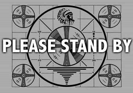
As this construction goes on, there might be periods when things won’t load properly or when something will look wrong. But it’s a work in progress and everything will be back to normal. Just give me time to fix it.
Thanks for your patience while things are under construction. I think you’ll appreciate the experience — especially those of you who read on mobile phones.
I appreciate every one of you. I hope you know that.
 My books tell the tale of who I was — and who I’m steadily becoming
 ‘This path leads to somewhere I think I can finally say, I’m home’
 What kind of savages are we today? ‘Pick ’em out and knock ’em out’